Lecture 2
Outline
Displaying and Describing Quantitative Data
Elementary probability theory
Correlation
Displaying Quantitative Variables
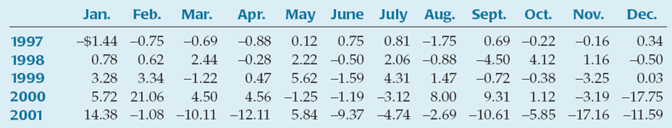
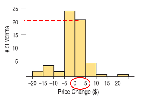
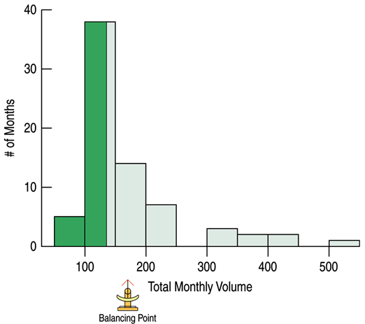
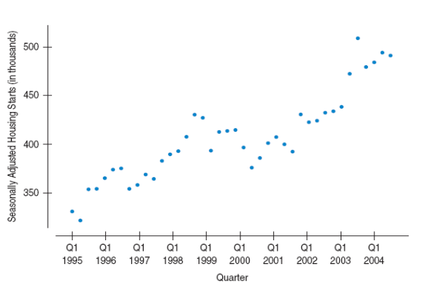
Example of quantitative data: monthly changes in a stock prices
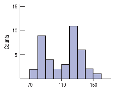
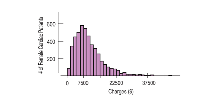
Histograms
A histogram is similar to a bar chart with the bin counts used as the heights of the bars. Note: there are no gaps between bars unless there are actual gaps in the data.
Other
A relative frequency histogram is displaying the percentage of cases in each bin instead of the count.
Stem-and-leaf displays are like histograms, but they also give the individual values.
Example: Create a stem-and-leaf display for the data 21, 22, 24, 33, 33, 36, 38, 41.
2|124
3|3368
4|1
Elementary probability theory
Shape
When you describe a distribution, you should pay attention to its:
shape
center
spread
We describe the shape of a distribution in terms of its modes, its symmetry, and whether it has any gaps or outlying values.
Mode
Peaks or humps seen in a histogram are called the modes of a distribution.
A distribution whose histogram has
one main peak is called unimodal
two peaks - bimodal
three or more - multimodal
Symmetry
A distribution is symmetric if the halves on either side of the center look, at least approximately, like mirror images.
The thinner ends of a distribution are called the tails. If one tail stretches out farther than the other, the distribution is said to be skewed to the side of the longer tail.
Outliers
The outliers in a distribution are those values that stand off away from the body of the distribution.
can affect every statistical method we will study
can be the most informative part of your data
may be an error in the data
should be discussed in any conclusions drawn about the data
Center
The mean of a distibution is caclualted as sum of all values, $y_i$, and divided by the number of values, $N$.
The mean is considered to be the balancing point of the distribution.
Median
The median is the value separating the higher half the data from lover part.
The median is resistant to unusual observations and to the shape of the distribution.
Spread
Sometimes we need to determine how spread out the data.
One simple measure of spread is the range, defined as the difference between the extremes.
The range is a single value and it is not resistant to unusual observations.
Quartiles
The quartiles of a ranked set of data values are the three points that divide the data set into four equal groups, each group comprising a quarter of the data.
The first quartile (Q1) is defined as the middle number between the smallest number and the median of the data set, 25th percentile
The second quartile (Q2) is the median of the data, 50th percentile
The third quartile (Q3) is the middle value between the median and the highest value of the data set, 75th percentile
Interquartile Range
The interquartile range (IQR) is defined to be the difference between the two quartile values.
Variance
The average of the squared deviations of the values of the variable y from the mean is called the variance and is denoted by $s^2$.
Taking the square root of the variance corrects this issue and gives us the standard deviation.
Guide
If the shape is skewed, the median and IQR should be reported.
If the shape is unimodal and symmetric, the mean and standard deviation and possibly the median and IQR should be reported.
If there are multiple modes, try to determine if the data can be split into separate groups.
If there are unusual observations point them out and report the mean and standard deviation with and without the values.
Always pair the median with the IQR and the mean with the standard deviation.
Boxplot
The five-number summary of a distribution reports its median, quartiles, and extremes (maximum and minimum).
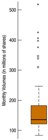
Boxplot (cont)
The central box shows the middle half of the data, between the quartiles – the height of the box equals the IQR.
If the median is roughly centered between the quartiles, then the middle half of the data is roughly symmetric.
If it is not centered, the distribution is skewed.The whiskers show skewness as well if they are not roughly the same length.
The outliers are displayed individually to keep them out of the way in judging skewness and to display them for special attention.
Example
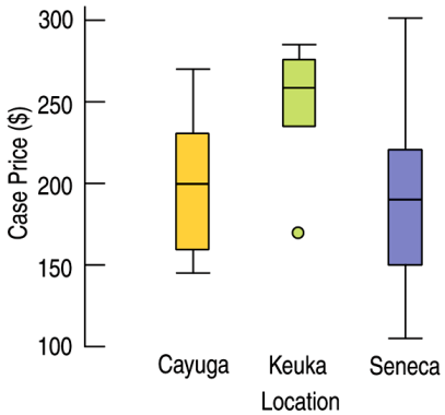
Example: Wine Prices The boxplots displayed case prices (in dollars) of wines produces by vineyards along three of the Finger Lakes in upstate New York.
a. Which lake region produces the most expensive wine? b. Which lake region produces the cheapest wine? c. In which region are wines generally more expensive?
Example (cont.)
a. Seneca Lake b. Seneca Lake c. Keuka Lake
Cayuga Lake vineyards and Seneca Lake have approximately the same average case price of about 200, while a typical Keuka Lake vineyard has a case price of about 260. Keuka Lake vineyards have consistently high case prices, between 240 and 280, with one low outlier at about 170 per case. Cayuga Lake vineyards have case prices from 140 to 270, and Seneca Lake vineyards have highly variable case prices from 100 to 300.
Outliers
What should be done with outliers?
They should be understood in the context of the data.
They should be investigated to determine if they are in error.
They should be investigated to determine why they are so different from the rest of the data.
Standardizing
To compare different variables, the values are standardized by measuring how far they are from the mean.
We measure the distance from the mean and divide by the standard deviation, and the result is the standardized value.
The resulting value is a standardized value or z-score. A z-score tells how many standard deviations a value is from the mean.
Example
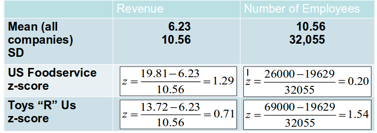
Compare two companies (from the “top” 100 companies) with respect to the variables Revenue (in $B) and number of Employees.
US Foodservice had $19.81B revenue and 26,000 employees.
Toys "R" Us had revenues of only $13.72B but 69,000 employees.
For all 100 companies, the mean revenue was $\$$6.23B with standard deviation \$10.56B; the average number of employees was 19,629 and standard deviation 32,055.
Example (cont.)
Example 2
Example: Customer Ages As part of a marketing team, you send surveys to 25 customers (using an incentive to guarantee a high response rate) asking for demographic information. The average age of respondents is 31.84 years , the standard deviation is 9.84 years, min is 11 years and max is 48 years. Which has the more extreme z-score, the min or the max?
Correlation
Scatterplot
Scatterplots are the ideal way to picture associations between two quantitative variables.
Direction
The direction of the association is important.
A pattern that runs from the upper left to the lower right is said to be negative.
A pattern running from the lower left to the upper right is called positive.
The second thing to look for in a scatterplot is its form.
Linear
The third feature to look for in a scatterplot is the strength of the relationship.
Tight or spread out
Example: Bookstore
Data gathered from a bookstore show Number of Sales People Working and Sales (in \$1000). Given the scatterplot, describe the direction, form, and strength of the relationship. Are there any outliers?
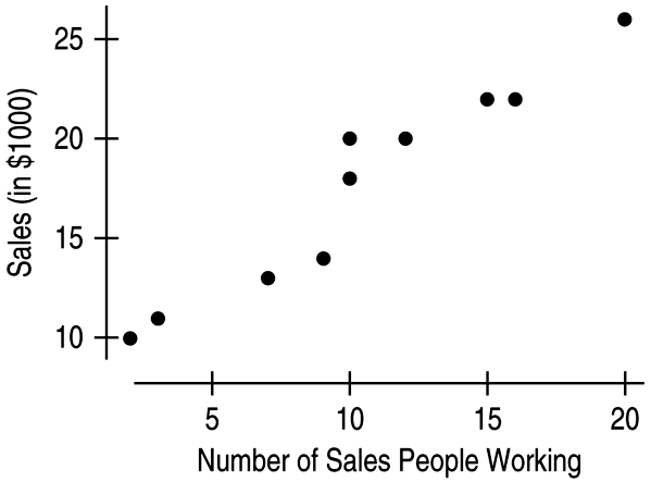
Example (cont.)
The relationship between "Number of Sales People Working" and "Sales" is positive, linear, and strong. As the "Number of Sales People Working" increases, "Sales" tends to increase also. There are no outliers.
Assigning Roles to Variables in Scatterplots
One variable plays the role of the explanatory or predictor variable, while the other takes on the role of the response variable.
We place the explanatory variable on the x-axis and the response variable on the y-axis.
The x- and y-variables are sometimes referred to as the independent and dependent variables, respectively.
Correlation
The ratio of the sum of the product $z_x z_y$ for every point in the scatterplot to $N–1$ is called the correlation coefficient.
Since x’s and y’s are paired, multiply each standardized value of x by the standardized value it is paired with and add up those crossproducts. Divide by n -1.
Understanding Correlation
Correlation measures the strength of the linear association between two quantitative variables.
Quantitative Variables Condition: Correlation applies only to quantitative variables.
Linearity Condition: Correlation measures the strength only of the linear association.
Outlier Condition: Unusual observations can distort the correlation.
Correlation Properties
The sign of a correlation coefficient gives the direction of the association.
Correlation is always between –1 and +1.
Correlation treats x and y symmetrically.
Correlation has no units.
Correlation is not affected by changes in the center or scale of either variable.
Correlation measures the strength of the linear association between the two variables.
Correlation is sensitive to unusual observations.
There is no way to conclude from a high correlation alone that one variable causes the other.